Visualizing Network Epidemic Models Using GraphStream

This fall I took a course in Network Science and it's been one of my favorite courses during my time at the University of Cincinnati. I've always liked graphs, and this course was all graph theory! One of the topics covered was different ways of describing epidemics in networks and recently I discovered the graph visualization library, GraphStream. I wanted to explore the library, and I liked the section on epidemic modeling, so I've gone and combined the two!
This blog post has two primary parts: a main section where I'll describe the different epidemic models and show off visualizations of them in different networks, and a secondary section where I'll describe my thoughts on the library and the source code I used to generate the models.
Epidemic Models
Epidemic models are mathematical models for describing the behavior of epidemics, specifically how they spread. My course covered compartmental epidemic models, and those are what I've visualized below. Compartmental epidemic models separate populations into different categories depending on the model. These compartments describe shared characteristics of the populations within them, such as susceptible, infected, or recovered.
In these models, infection is spread at a given rate beta. Any infected node has a chance beta to spread its infection along each edge with a probability of beta. A beta of 1 means the infection will certainly spread, and a beta of 0 means it will not. In my visualizations, infected nodes take the color red, immune nodes are green, and susceptible nodes are black. Edges are represented as gray lines between nodes.
SI Model
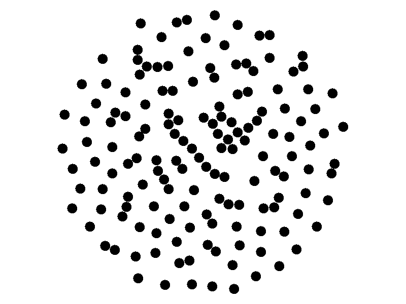
The SI model stands for Susceptible Infected. There are two compartments, one for susceptible nodes and one for infected nodes. Because the SI model is the simplest model I'll be discussing, it makes for a good chance to write about different types of networks. The simplest network, a random network is pretty boring - many nodes are unconnected, and when nodes are connected they form small components that an epidemic cannot escape.
Random networks don't really represent real world networks like some of the later networks I'll discuss do. Another network that makes for a boring example is a fully connected network. In a fully connected network all nodes have edges to all other nodes.
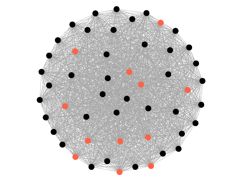
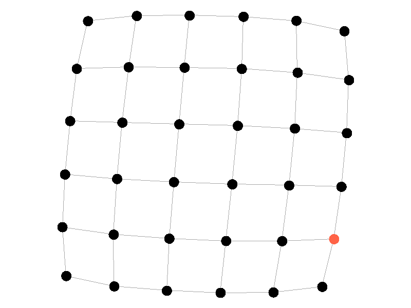
Epidemics in a fully connected network spread like wildfire. Every node has the chance to be infected by every infected node, meaning it only takes two iterations to infect all nodes in this sample network with a beta of 0.3. Not many real networks are fully connected. A small clique within a network might be fully connected, but rarely are entire networks fully connected. Regardless, epidemic modeling in fully connected networks is trivial and boring. A final network type that's boring is a grid network - grid networks are really just cool to look at but don't represent many real world networks.
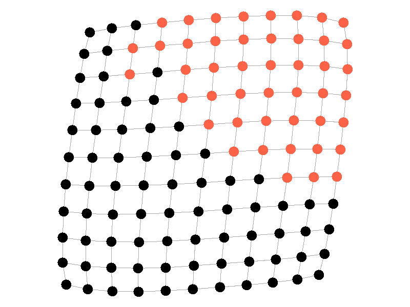
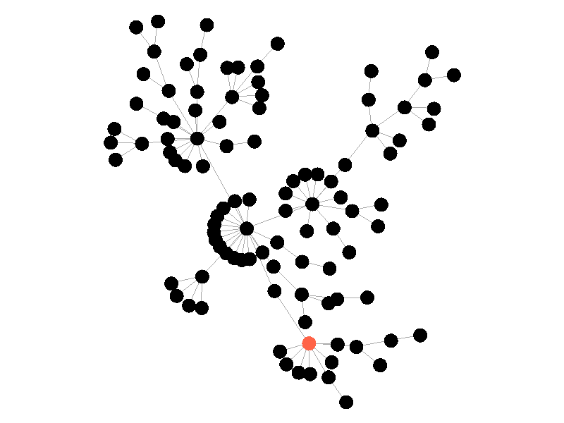
Many real life networks are what is known as scale free. A scale free network is a network in which the degree distribution follows the power law. In a scale free network there are few nodes that have very large degrees, and many nodes that have small degrees. Think of real life networks, such as road networks, and you'll likely realize them to be scale free. Main roads in town connect to many roads, while roads in neighborhoods connect to those main roads and few others. Likewise social networks often connect through a few socialites, people who maintain a very large number of connections, whereas the average person has a relatively small number of connections. The rest of this blog post will feature scale free networks, as they tend to be the most interesting and realistic for visualizing epidemics.
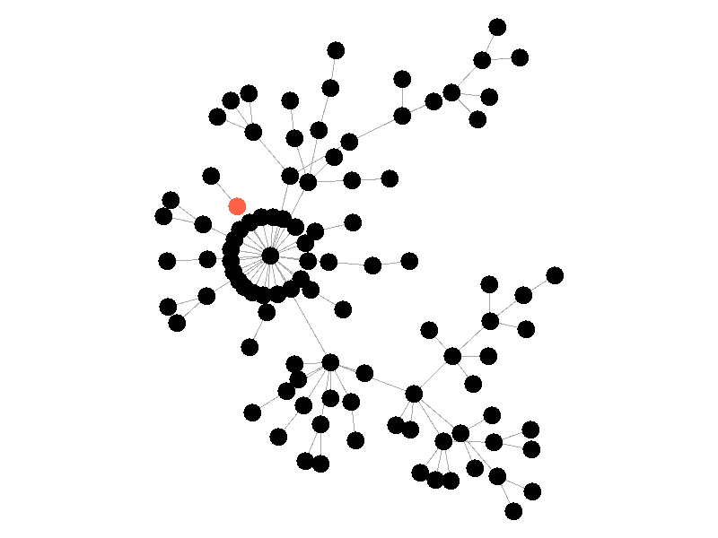
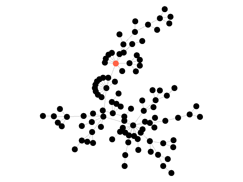
In the above network, the epidemic spreads with a beta of 0.3. Once the epidemic reaches a high-degree node, the number of infected nodes explodes. The high degree nodes will continue to lead to interesting behavior in later visualizations. Here is another visualization of the SI model with a much larger value of beta - 0.5.
The epidemic now spreads much quicker but is still limited by the topology of the network - that is it must infect all nodes along the path to furthest leaves in order to infect the whole network.
SIS Model
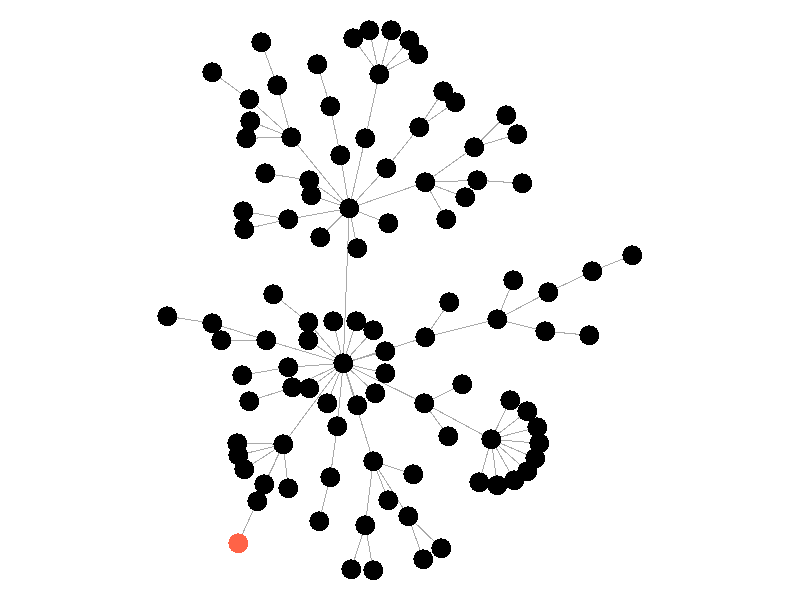
The SIS model adds another letter to the abbreviation but doesn't add another compartment. In the SIS Model nodes can now recover from the infection and return to the susceptible compartment. In these visualizations, infected nodes will change from red to black when they recover from the infection. The rate of recovery in the SIS model is determined by the parameter mu. Much like beta, mu is the probability that a given infected node recovers from its infection. The addition of this parameter creates some interesting behavior!
In the above network the beta is 0.5 and the mu is half of that, or 0.25. Much like in the SI network, once the epidemic reaches the high degree nodes, it explodes. But now, nodes recover at half the rate new nodes are infected, meaning the epidemic never accomplishes full infection. Of note is that the high degree node in the center is almost always infected - even if it does recover it is immediately reinfected by its neighbors. The SIS model introduces a new concept - persistence. If the recovery rate mu is too close or exceeds the infection rate beta, the epidemic will die out, like this example:
The equation that determines the survivability of an epidemic is known as the basic reproductive number R.
If R is greater than 1, the epidemic will spread. If R is less than 1, the epidemic will die out. There's no point to visualizing a mu that exceeds the value of beta; the epidemic dies out without spreading.
SIR Model
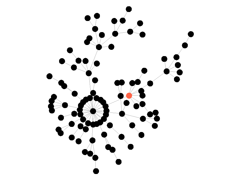
The SIR Model adds a new compartment: immune. In the SIR model nodes can also recover, but now recovered nodes are immune to the epidemic and can't be reinfected. The rate at which nodes recover is still governed by the parameter mu. Immune nodes are shown as green in the visualization, and because immune nodes can never be reinfected, mu now only needs to be a fraction of beta.
The addition of immunity adds a new dynamic, especially in scale free networks. When high degree nodes become immune, entire sections of the network become protected from the epidemic, as shown in the top right of the above network.
In this network, because the high degree nodes quickly attain immunity, the epidemic is quickly contained. This visualization quickly demonstrates how effective vaccinating high degree nodes in a real life network can be. Increasing the value of mu further serves only to end epidemics more quickly.
Source Code and GraphStream
I've made the source code I used to generate these visualizations open source on my GitHub. I won't pretend it's the cleanest code I've ever written, because it isn't. I made some weird choices on architecture for such a small project, like using inheritance to manage the similarity of the different models.
The code to generate these visualizations actually isn't very complex! Calculating these models is as simple as calculating probabilities and switching set membership, with some additional code to handle recoloring in the graph. For instance, here's the code that infects new nodes on each step in the SI model:
@Override
public void step() {
    Set<Node> toBeInfected = new HashSet();
    // iterate through already infected nodes and find new infections
    // add them to the set to be later marked as infected
    for (Node node : infected) {
        Iterator<Node> neighborsIter = node.getNeighborNodeIterator();
        while (neighborsIter.hasNext()) {
            Node neighbor = neighborsIter.next();
            if (this.rGen.nextDouble() < this.beta) {
                toBeInfected.add(neighbor);
            }
        }
     }
     // iterate over nodes to be infected and switch them, then mark them
     for (Node node : toBeInfected) {
        // Switch the set membership
        susceptible.remove(node);
        infected.add(node);
        node.setAttribute("ui.class", "infected");
     }
}
When it comes to the GraphStream library, I initially loved it. It makes beautiful, easily configurable visualizations of networks, and it comes with generators for different types of graphs right in the box. It has some interesting paradigms for handling things like screenshots, and I struggled a lot with managing that code. Unfortunately the community around the library isn't very large, and the documentation seems to be incomplete. All the same, I recognize it's an open source library and it's fantastic for what it is. It's difficult to visualize large networks, probably regardless of the library used to do it, which unfortunately makes it unrealistic to use GraphStream for large data sets. But, for what I used it for, I liked it, and I look forward to using it again in the future!